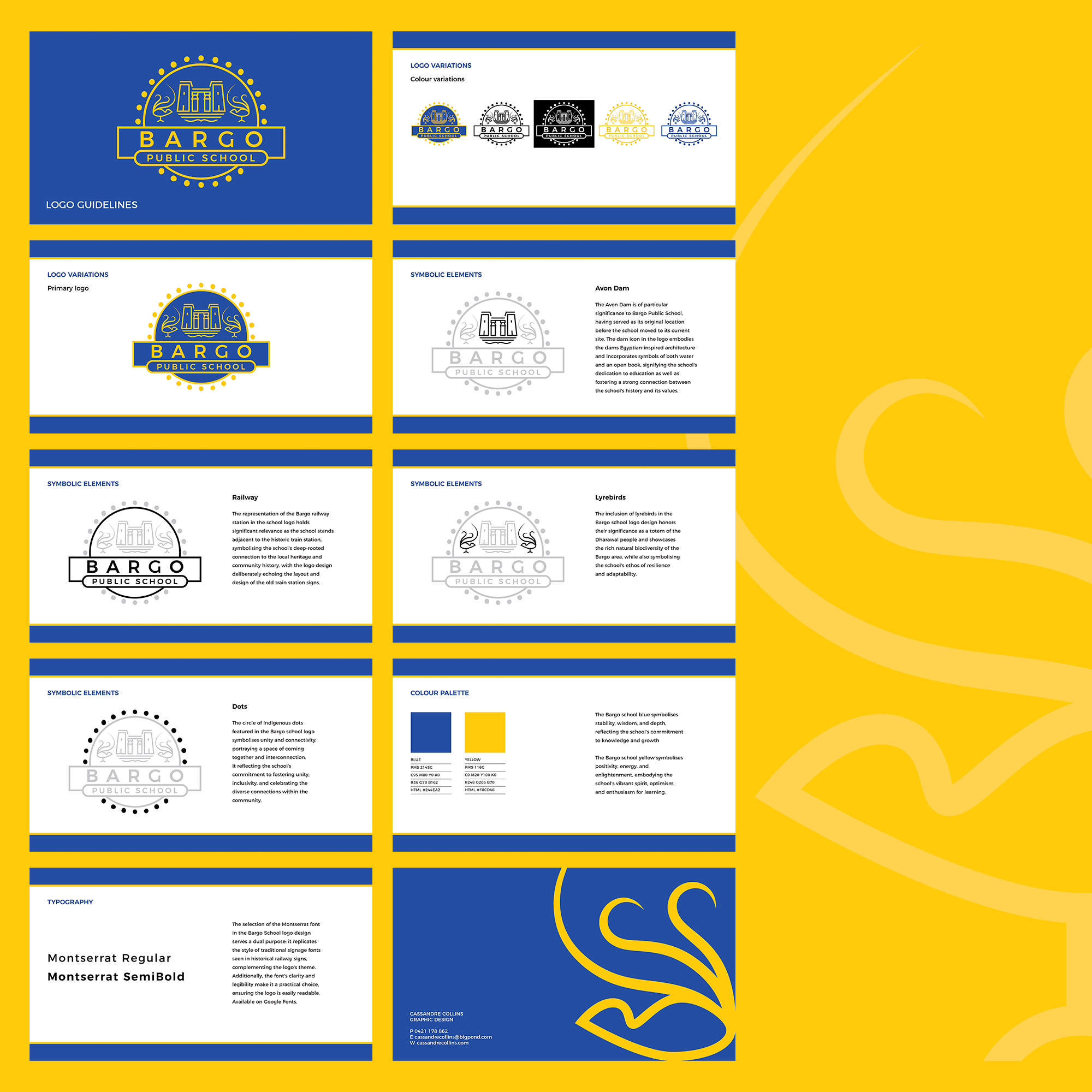
Introducing the new Bargo Public School logo, designed to blend together history, connectivity, individuality, and community, reflecting the school’s deep roots and dedication to a vibrant and inclusive learning atmosphere.
Colour variations
Design elements
The design of Bargo Public School’s new logo is deeply rooted in its history and values, with four main elements playing a significant role.
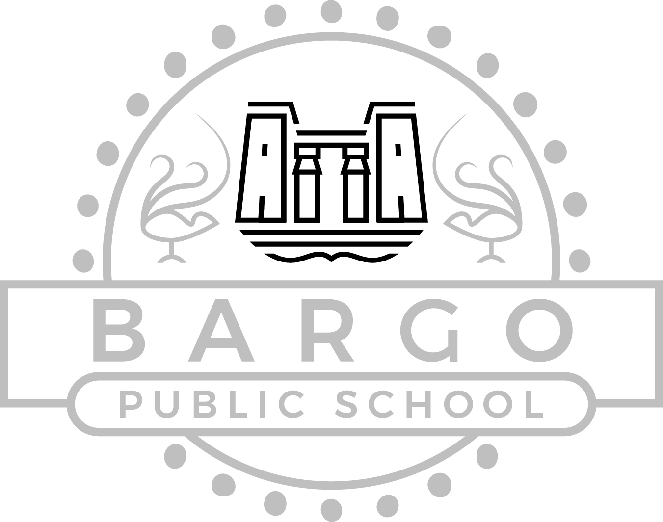
Avon Dam is of particular significance to Bargo Public School, having served as its original location before the school moved to its current site. The dam icon in the logo embodies the dams Egyptian-inspired architecture and incorporates symbols of both water and an open book, signifying the school’s dedication to education as well as fostering a strong connection between the school’s history and its values.
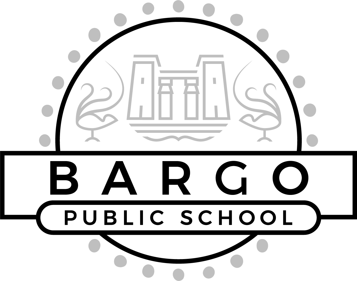
The representation of the Bargo railway station in the school logo holds significant relevance as the school stands adjacent to the historic train station, symbolising the school’s deep-rooted connection to the local heritage and community history, with the logo design deliberately echoing the layout and design of the old train station signs.
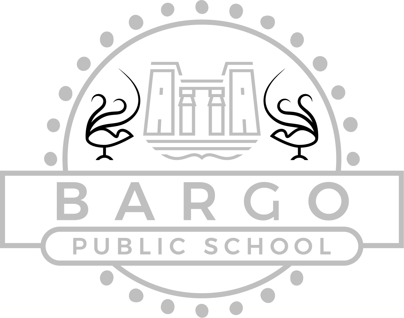
The inclusion of lyrebirds in the Bargo school logo design honours their significance as a totem of the Dharawal people and showcases the rich natural biodiversity of the Bargo area, while also symbolising the school’s ethos of resilience and adaptability.
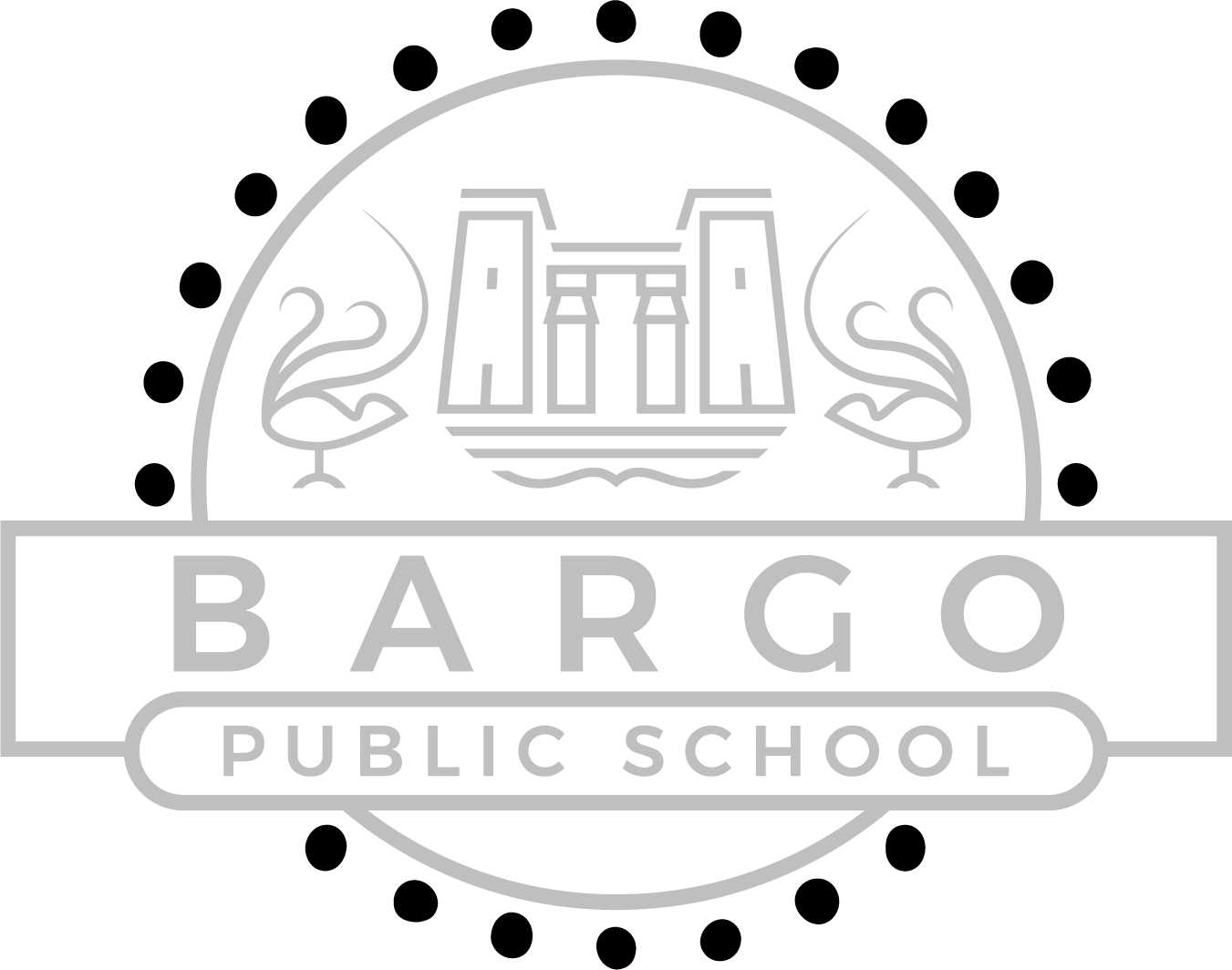
The circle of Indigenous dots featured in the Bargo school logo symbolises unity and connectivity, portraying a space of coming together and interconnection. It reflects the school’s commitment to fostering unity, inclusivity, and celebrating the diverse connections within the community. Use of the dots in the logo design was suggested and approved by the Indigenous staff at Bargo Public School.
Logo package
The Bargo Public School logo design package included a comprehensive logo suite, logo guidelines and a stationery suite.