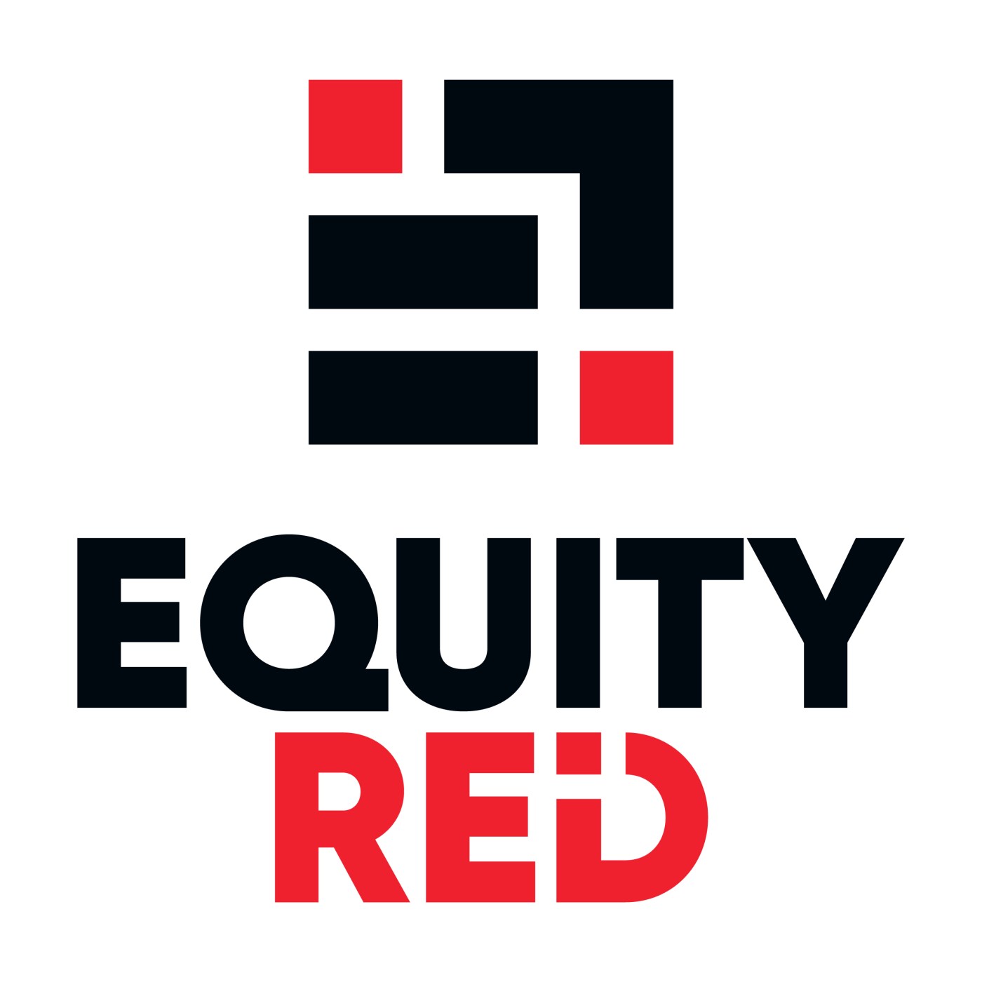
Logo and brand identity design for Equity Red.
Equity Red is a company represented by its brands.
The client brief was to create a non-pigeonholed logo that could represent anything. The logo was to incorporate the elements of fairness and security, and convey that they offer a mutually beneficial relationship between themselves and their clients who can grow their equity by engaging with Equity Red’s brands.
The Equity Red symbol contains the elements of equity in the equal sign and growth in the arrow, together with the feelings of security and group conveyed by the red squares locking the graphic together, creates a unified symbol. It can be used on its own or with the wordmark depending on what works best for the application.
The Equity Red wordmark reflects the logo symbol with the ‘I’ and ‘D’ interlocking. The wordmark must always be seen with the Equity Red symbol as either the full logo or as separate elements depending on the application.


