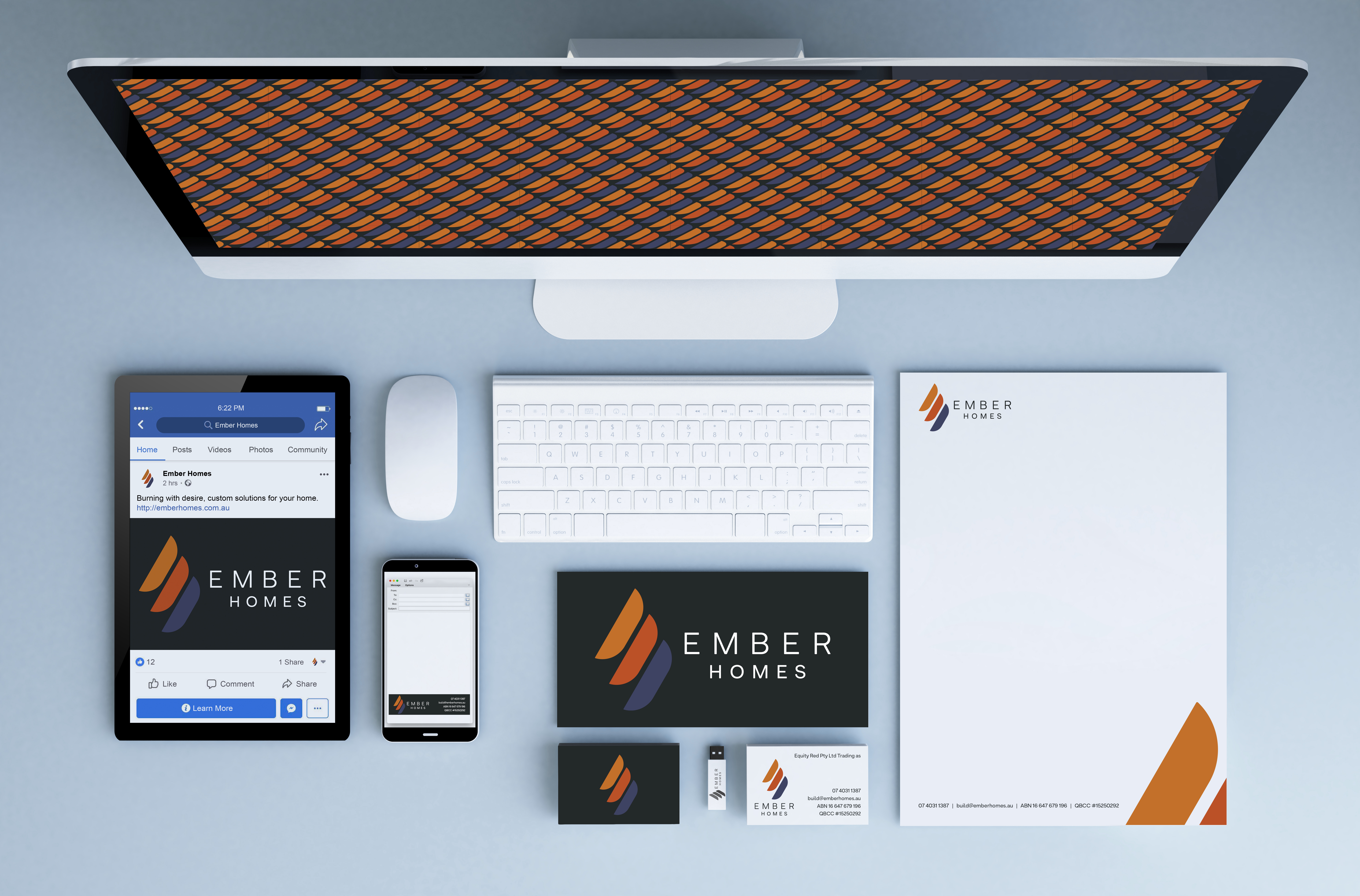
Logo and brand identity design for Ember Homes.
The client brief was to create a dark, sexy, mysterious logo, that reflected the businesses custom solutions for the higher end of the home building market, including building on complex or sloping sites.
Incorporating the letter E and the elements of burning embers and flames, the symbol is the primary asset in the Ember Homes logo. It can be used on its own or with the wordmark depending on what works best for the application.
The Ember Homes wordmark uses the Armin Soft font and compliments the simple shapes and subtle rounded corners in the symbol. The wordmark must always be seen with the Ember Homes symbol as either the combined logo as seen here or as seperate elements depending on the application.